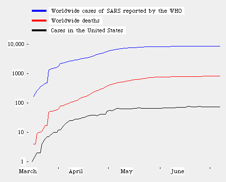

The graph shows the number of world cases of SARS, worldwide deaths, and cases in the United States. The vertical distance is the logarithm base 10 of the number of cases. Each factor of 10 increase causes the graph to rise by the same increment. The data is from the World Health Organization (WHO) at the Cumulative Number of Reported Cases (SARS) page.
Severe Acute Respiratory Syndrome is a new disease that originated in southern China in November 2002. Please see the US Centers for Disease Control's SARS factsheet. It includes a description of the symptoms, what to do if you think you have been exposed, and what precautions to take to avoid exposure.
One of the best ways of judging the growth if an epidemic is to make a bar chart the date of onset of symptoms of the disease. The WHO has prepared several excellent Date of Onset Bar Charts by country. The world Date of Onset Bar Charts is very informative. The decline in the last seven days of each chart is deceptive, since people with mild initial symptoms have not yet been detected or counted.
Here is a diagram of the people infected by one "super spreader" at the Metropole Hotel in Hong Kong.
The SARS epidemic has been completely contained. The last affected area, Tiawan, China was removed from the list on July 5th. The next major milestone will be when the last patient comes out of isolation. No more updates to this page are planned.
The containment of SARS is an extraordinary achievement for humanity. The deathrate in areas with modern medical care, such as Canada, was 10 percent. In the underdeveloped world, SARS could have killed an even higher percentage. The public health workers and decision makers who acted swiftly and bravely to stop SARS probably saved the lives of one billion people.
The purpose of this site is to allow the reader to check if the growth of SARS has become exponential. The doubling times remained essentially constant, meaning that SARS was growing exponentially, between April 2nd and May 5th. During that time, the number of cases went from 2200 to 6600. Recently, the number of new world cases each day has been declining. The outbreak has not been growing exponentially since about May 5th.
Until April 20th, the US cases were reported as the number of cases investigated, rather then the number of confirmed SARS cases. The numbers shown on the graph before April 20th are estimates. On April 18th, there were 35 confirmed cases in the US using the WHO definition, and 208 cases by the old method. US data before April 20th has been multiplied by 35/208 which is 0.1683.
Here is a page that tells How the Doubling Time is Computed.
Epidemics usually follow S-shaped curves. The forecast here are based on pure exponential growth. When the middle of the S-shaped curve is reached, the rate of infection will slow, and exponential growth forecasts will no longer be useful. Recent data shows that the epidemic has left its exponential growth phase.
The WHO does not report statistics on Saturdays or Sundays, so this page does not change on those days.
Powered by Squeak.
(c) Ted Kaehler 2003. Permission is hereby granted for unlimited reproduction and redistribution of this page and any of its information.